As the vibrant colors of summer gently give way to the earthy tones of fall, a soothing color palette emerges, capturing the essence of the season’s beauty. Known as the “Natural Habitat” palette, this exquisite collection of hues seamlessly blends the warm undertones of autumn with calming neutrals, creating a harmonious balance that is both timeless and versatile.

Natural Habitat: Embracing the Warmth of Fall’s Neutral Tones
As the vibrant colors of summer gently give way to the earthy tones of fall, a soothing color palette emerges, capturing the essence of the season’s beauty. Known as the “Natural Habitat” palette, this exquisite collection of hues seamlessly blends the warm undertones of autumn with calming neutrals, creating a harmonious balance that is both timeless and versatile.
The Natural Habitat palette celebrates nature’s raw beauty by combining the inherent warmth of autumn with the subtle elegance of neutral tones.
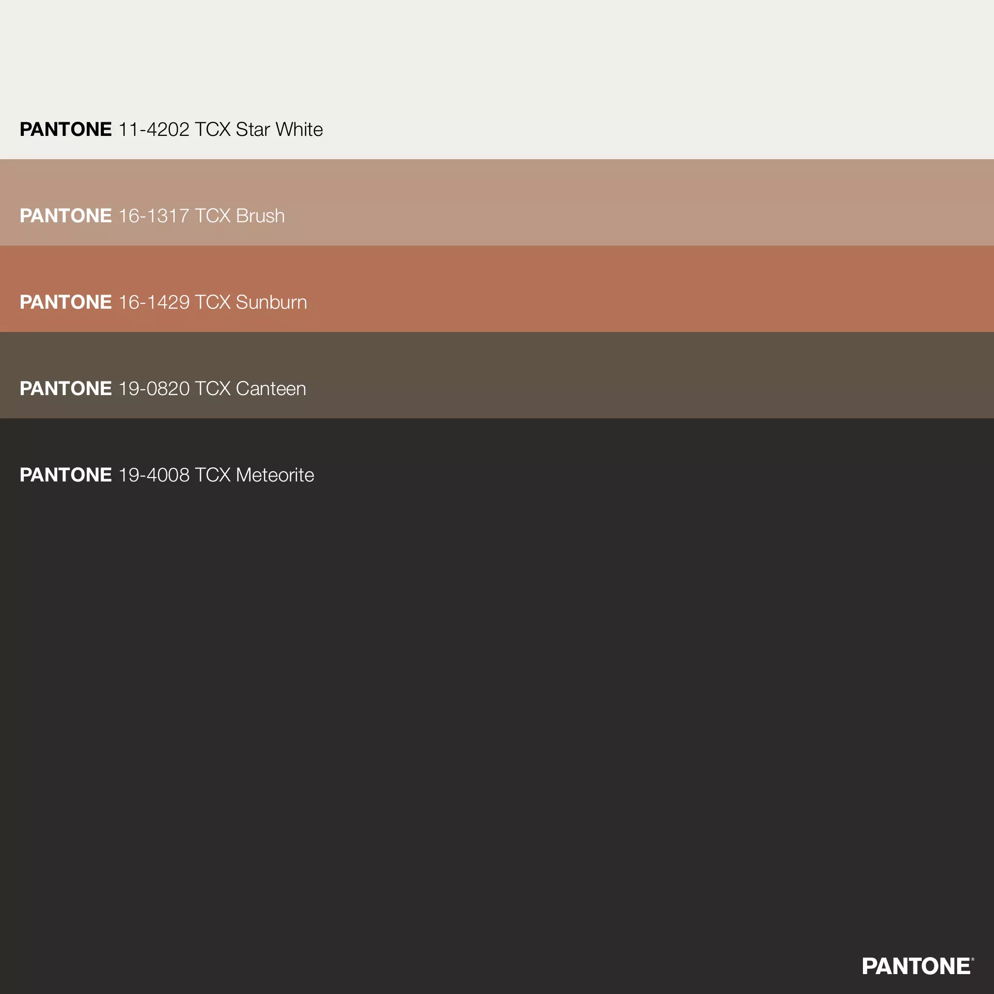
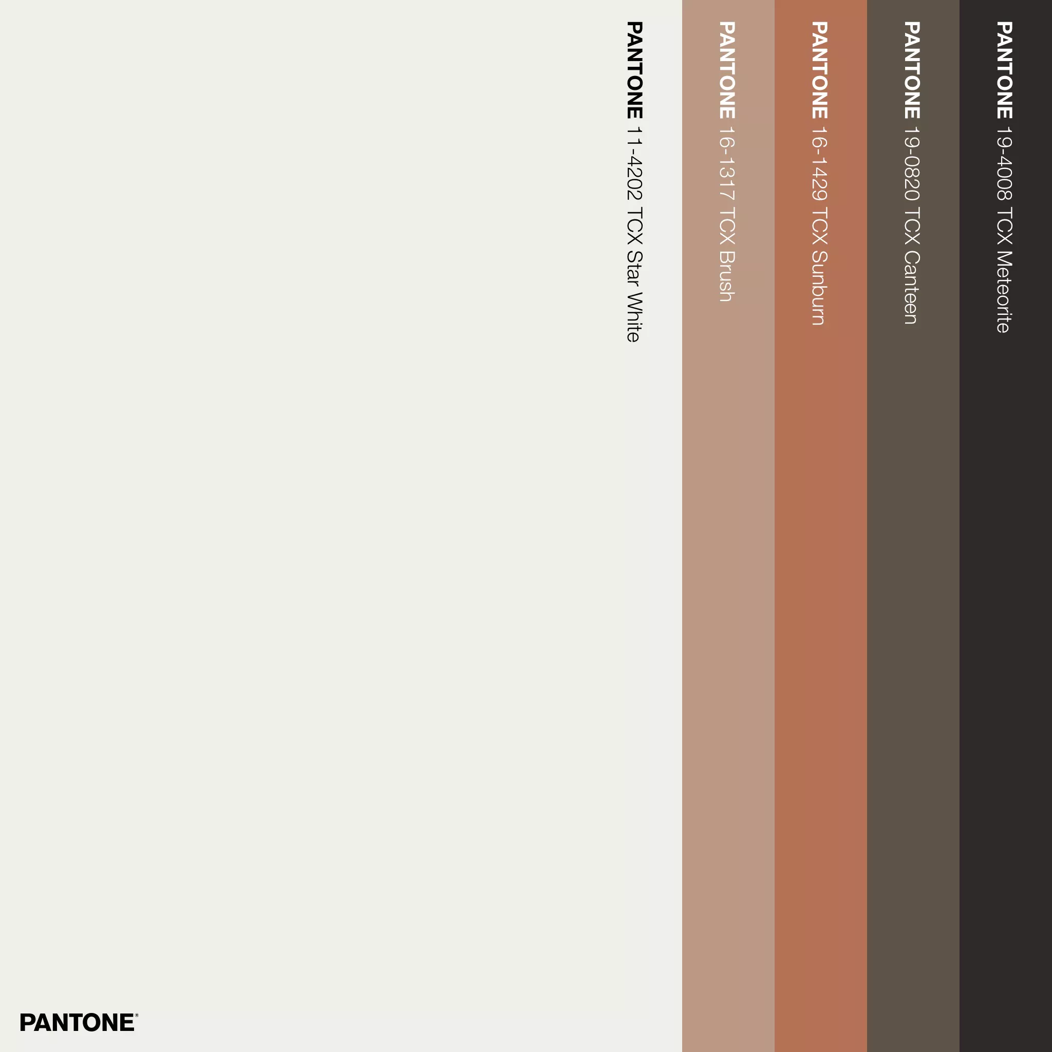
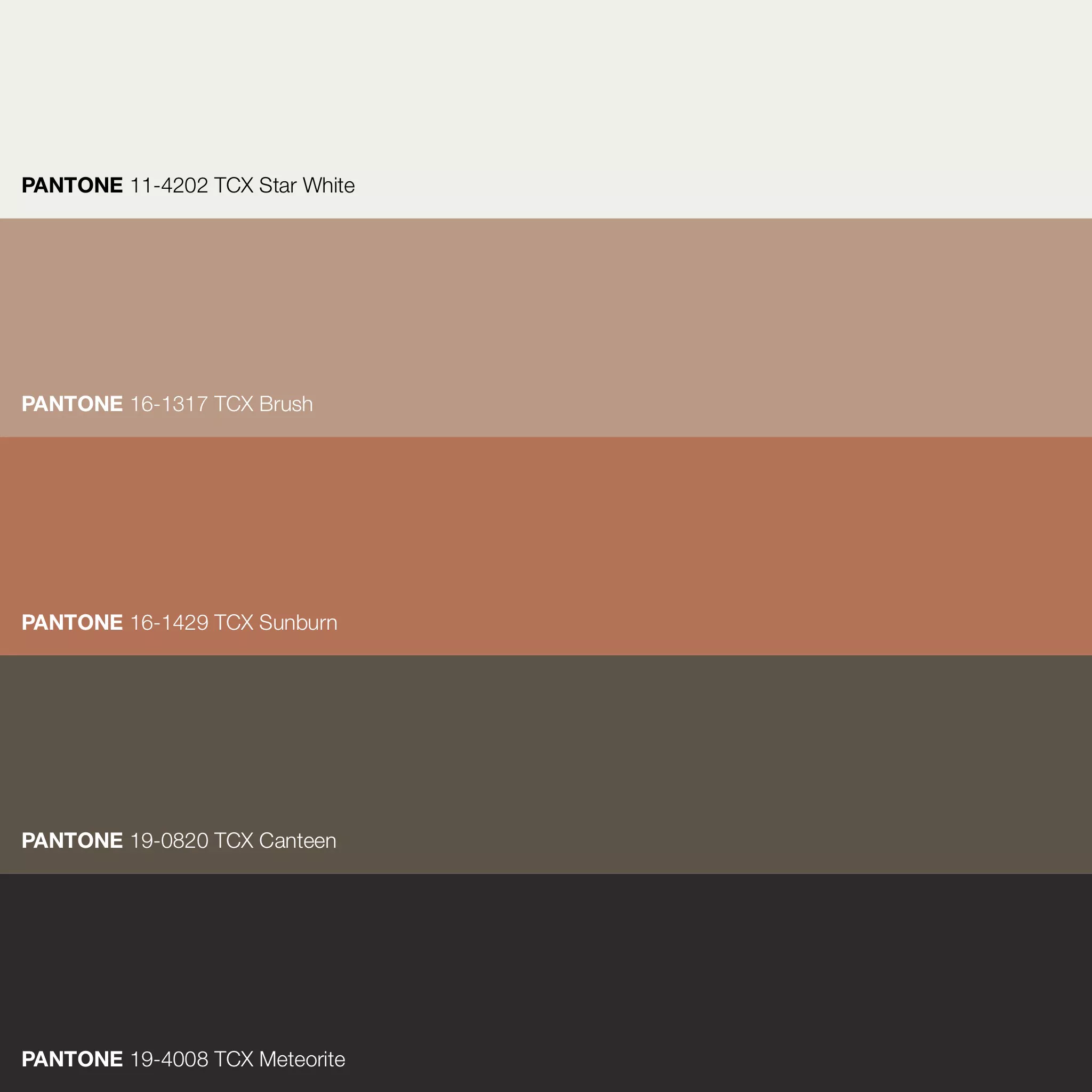
Comprising five carefully selected colors, each shade pays homage to the intricate details of our natural world. This palette invites you on a journey through an organic tapestry that connects ancient landscapes, earthy pigments, and the ever-shifting sands of time.
PANTONE 11-4202 TCX Star White · FHI Cotton TCX · Lab 94,28 -0,59 3,04 · RGB(239, 239, 232) · HEX #EFEFE8
PANTONE 16-1317 TCX Brush · FHI Cotton TCX · Lab 65,97 10,68 15,82 · RGB(185, 153, 132) · HEX #B99984
PANTONE 16-1429 TCX Sunburn · FHI Cotton TCX · Lab 55,06 25,54 27,26 · RGB(179, 114, 86) · HEX #B37256
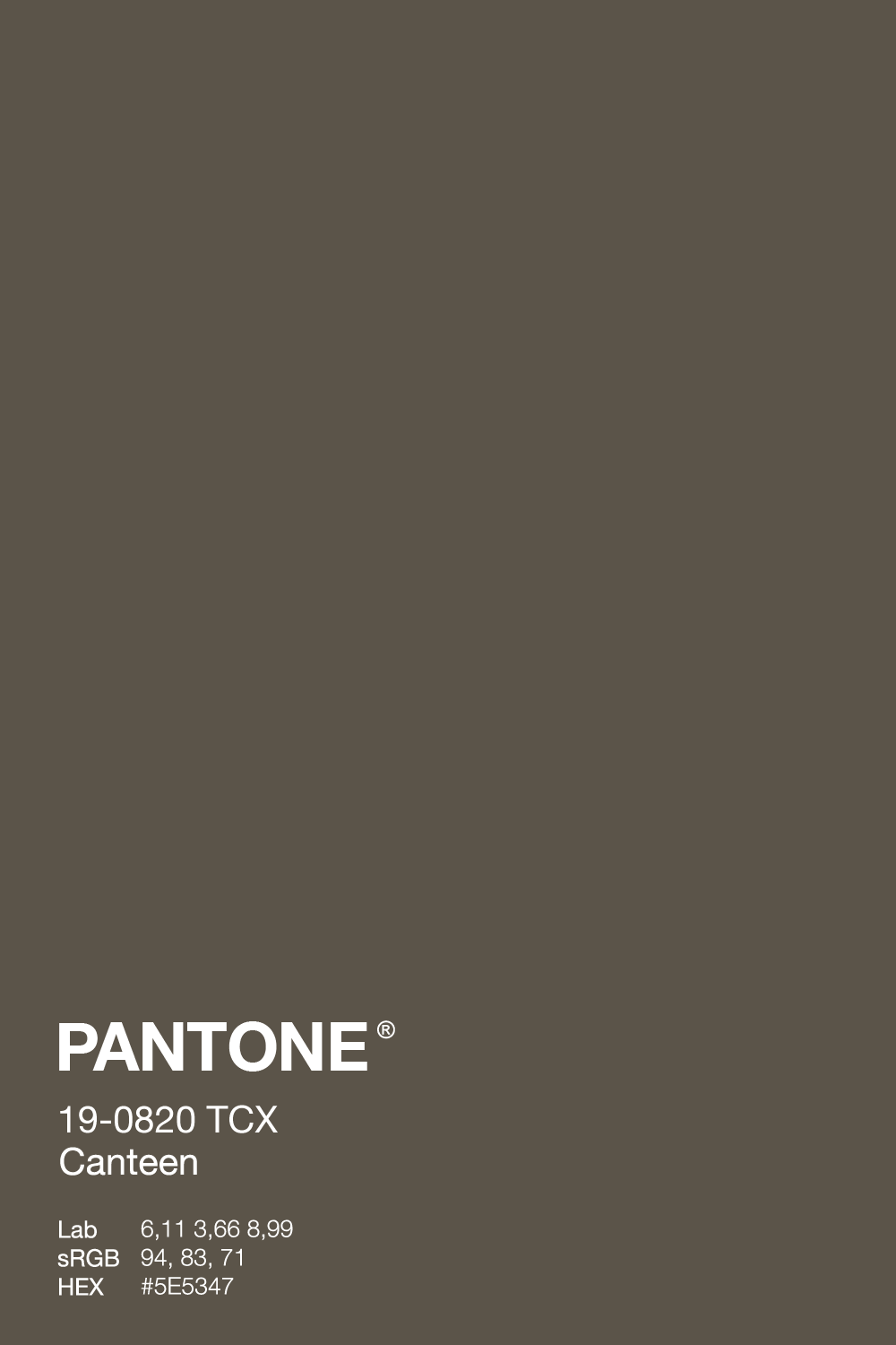
PANTONE 19-0820 TCX Canteen · FHI Cotton TCX · Lab 36,11 3,66 8,99 · RGB(94, 83, 71) · HEX #5E5347
PANTONE 19-4008 TCX Meteorite · FHI Cotton TCX · Lab 16,50 2,10 0,11 · RGB(44, 41, 41) · HEX #2C2929


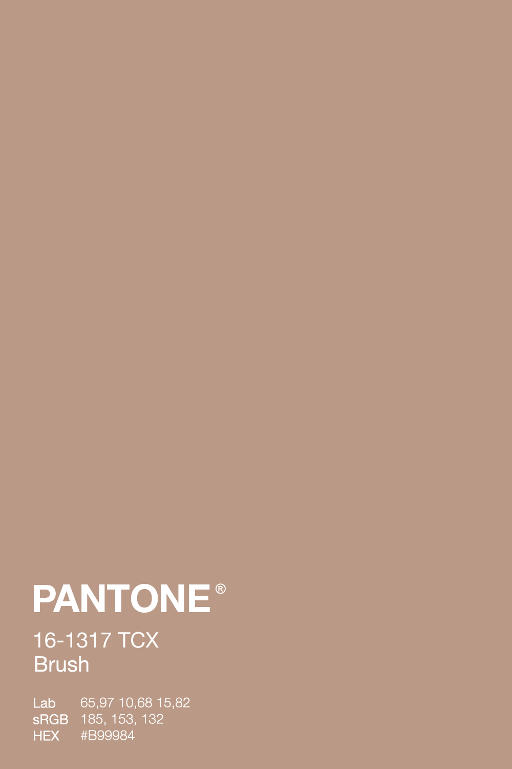

At the heart of this palette is Star White, an ethereal hue that echoes the delicate whisper of autumn’s first frost. This soft and gentle shade adds a touch of tranquility and grace, balancing the warmer, earthier tones within the palette. A versatile, warm, neutral Brush combines the selection, evoking the sun-bleached driftwood and weathered brush of a timeless landscape.
Sunburn deepens the palette with its rich terracotta and sun-drenched clay tones reminiscent of balmy evenings and lingering sunsets. Canteen, an earthy taupe, conjures images of soil-rich forests and crumbling clay walls, grounding the palette with a sense of ageless wisdom. Finally, Meteorite, a deep charcoal gray, anchors the selection, evoking the mystery of the night sky and the steadfast resolve of eroding cliffs.
Together, these hues tell the story of a Natural Habitat—a celebration of earthly beauty as diverse and captivating as the landscapes it honors. The Natural Habitat palette captures the essence of fall’s warm neutrals, weaving a chronicle of timeless beauty through every shade.
The Story of the Color Brown
Historical Significance: Brown is a rich and multifaceted color that has played a significant role in art and fashion for centuries. Its use dates back as far as 40,000 years ago, with early humans utilizing brown pigments in cave paintings, underscoring its enduring importance in human history. During the Renaissance, artists used brown in their underpaintings to add depth and intensity to their works. By the late 18th and early 19th centuries, brown had become a fashionable color, especially in outerwear, with coats and jackets from brown wool gaining popularity. Today, brown remains a staple in the fashion industry, often associated with luxury and sophistication.
Origins: Brown is created by blending complementary colors—typically a warm hue like red, yellow, or orange with a cool hue like blue or green. This combination results in shades ranging from light tan to deep chocolate brown. The term “brown” is derived from the Old English word “brun,” meaning dark, dusky, or coffee-colored. Brown is a ubiquitous color in nature, evident in everything from soil and tree bark to animals like bears, lions, and deer. Its natural warmth and versatility make it a popular choice in interior design.
The Elegance of Brown: Brown is a versatile, elegant color that exudes warmth, comfort, and stability. In interior design, it is often used to create a cozy and inviting atmosphere. Darker shades of brown, such as chocolate brown, can add depth and sophistication to any ensemble. Brown is also a favored choice for accessories like bags, shoes, and belts, as its rich, earthy tones complement a wide range of colors, making it a must-have in any stylish wardrobe.
Famous Brown Artworks: Brown has been prominently featured in renowned artworks across the globe. From the sepia tones of antique photographs to the burnt sienna used by Vincent van Gogh, brown has left its mark on the art world. One of the most notable works featuring brown is Caravaggio’s “Boy with a Basket of Fruit“ (1593), where brown is employed to create depth and contrast, highlighting the innocence and playful nature of the young boy depicted in the painting.
Color Psychology & Meaning of Brown Colors
Stability: Brown is frequently linked with stability and reliability, reflecting its deep connection to the earth and natural order. Companies like UPS and Louis Vuitton choose brown in corporate branding to symbolize trust and dependability. In architecture, brown is often employed to anchor a structure, providing a sense of solidity and strength.
Simplicity: Brown is a straightforward color that evokes warmth and subtlety when incorporated into design. Its simplicity and calming effect make it a popular choice in minimalist interior design, where it contributes to a serene and uncluttered atmosphere.
Dependability: Brown is a timeless color that embodies dependability and has remained fashionable in both fashion and interior design for centuries. It symbolizes longevity and reliability, serving as a grounding force in an ever-changing world.
Friendship: Brown often symbolizes friendship and community. In nature, it represents togetherness and cooperation, as seen in the social behaviors of animals like meerkats and prairie dogs. This warm and welcoming color is frequently used in hospitality branding to convey a sense of comfort and connection.
The Significance of the Pantone Color Star White
At the forefront of the Natural Habitat palette, Star White captures the essence of autumn’s first frost with its soft, luminous hue reminiscent of fresh snow or milk. This delicate color sets a serene foundation upon which the other colors in the palette can flourish. As a central hue, Star White symbolizes the passage of time and the fleeting beauty of the unseen. Its name, derived from the Latin “stella,“ meaning “star,“ evokes a sense of purity and celestial wonder.
In art and design, Star White carries symbolism that extends beyond its elegant appearance, representing a connection to the cosmos and the divine. Historically, white pigments have been used since around 20,000 BCE, with early civilizations like the Egyptians and Romans employing white as a symbol of purity in their religious and cultural practices. This symbolism endured into the Renaissance, where artists such as Michelangelo and Leonardo da Vinci prominently featured white in their works.
With its neutral tone, Star White plays a crucial role in maintaining visual harmony within the Natural Habitat palette. It accommodates variations in tints, shades, and tones, evoking a sense of peace, purity, and tranquility. By exploring the enduring charm of autumn’s warm neutrals, we uncover a rich tapestry of interconnected histories, cultures, and natural landscapes. Each color in the Natural Habitat palette is a thoughtful tribute to the delicate and timeless balance found in nature’s magnificent beauty.
As we delve deeper into the palette, we encounter Brush, a versatile and warm neutral that seamlessly ties the collection together. This natural beige, reminiscent of sun-bleached driftwood and weathered brush, reflects a genuine connection to the environment. It evokes the timeless qualities of centuries-old linen, tanned skins, and parched earth. Next, Sunburn enriches the palette further, capturing the essence of terracotta and sun-drenched clay. This warm, comforting hue conjures images of balmy evenings, lingering sunsets, and a landscape in constant flux.
Canteen, a grounded earthy taupe, recalls soil-rich forests and crumbling clay walls. It anchors the palette with a sense of timeless wisdom, drawing inspiration from Mother Nature’s rugged beauty and enduring creations. Finally, Meteorite, a steadfast charcoal gray, provides the grounding force that unites these colors. This deep gray, with a hint of warmth, evokes the mystery of the night sky and the quiet strength of eroding cliffs, encouraging introspection and stability.
Together, these hues create a symphony of natural beauty—a palette that echoes the shifting sands, eternal skies, and diverse landscapes of a Natural Habitat. Each color captures the essence of earthly beauty, contributing to a collection that celebrates the exquisite nature of fall’s warm neutrals in a timeless and elegant chronicle.
Color inspiration from Kid’s Palette. Visit their website for full information and inspiration on these color combos and for more ideas.
Sources & Credits
- Etymonline · Star
- Visual Arts Cork · History of Colour
- The Metropolitan Museum of Art · The Last Judgment
- Artsy · The Brief History of Color in Art
- Color Meanings · Brown Color Meaning: The Color Brown Represents Stability and Reliability
- 99designs · Color Symbolism in Art
- Borghese Gallery · Boy with a Basket of Fruit
- 99designs · Color Symbolism in Design
- Color Meanings · Brown Color Meaning: The Color Brown Represents Stability and Reliability
- University Art · It is all About Color Brown
- 99designs · Color
- Pinterest — Anthropologie from Anthropologie.com follow their Instagram