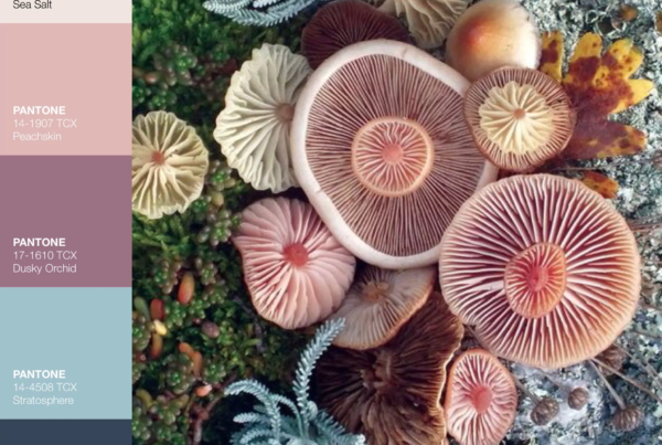
The Autumnal Opposites palette is a mesmerizing fusion of dynamic, vivid shades and opulent, muted neutrals, artfully arranged to mimic the harmonious crescendo of fall. Drawing from the transformative beauty of seasonal shifts, it endeavors to revolutionize our perception of color by instigating a captivating interplay between opposing tones. The intense depth and saturation of these hues conjure a vivid tableau boldly announcing the arrival of autumn.
This contemporary interpretation offers a revitalizing perspective, seamlessly blending futuristic influences with the organic hues of our planet, resulting in an ongoing, harmonious dialogue that evolves with every glance.


A Symphony of Hues: The Art of Balance
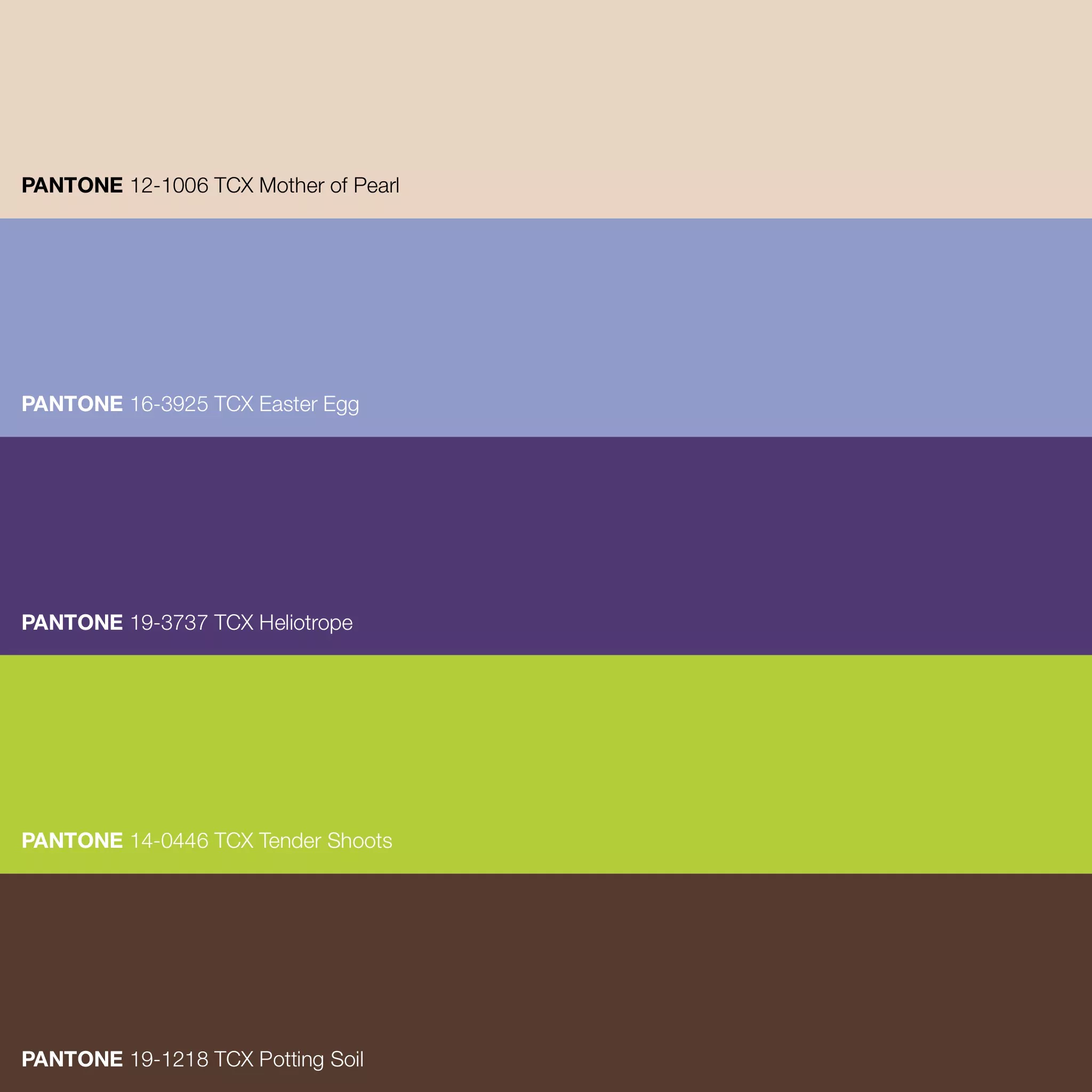
The Autumnal Opposites color palette orchestrates a captivating dance of chameleon-like shades, seamlessly interweaving the delicate whispers of Mother of Pearl with the vibrant vitality of Tender Shoots. Together, these colors form an intricate ballet, engaging in a perpetual conversation as they traverse the spectrum.
Cool lilacs and opulent violets contrast the late-summer earthiness of Potting Soil and Heliotrope’s profound, almost mystical aura. These opposing forces find their equilibrium in the radiant, effervescent presence of Easter Egg. This hue bridges the natural world and human creativity within this innovative exploration of autumnal colors.
At the heart of this palette lies the gentle embrace of Mother of Pearl—a hue steeped in history, its origins rooted in the iridescent beauty found within mollusk shells. This color has long been synonymous with elegance and refinement throughout various cultures, gracing decorative arts with its timeless allure. A creamy softness serves as the cornerstone of the palette, providing a neutral, grounding foundation amidst the lively discourse of hues.
In color theory, harmonious palettes deftly play with tints, shades, and tones to craft dynamic experiences for our senses, evoking various emotions and associations. This interplay is beautifully embodied in the Autumnal Opposites palette, where the equilibrium of cool and warm shades, and bold and subtle tones—the interplay of the natural and the artful—imbues it with a compelling allure that captivates the beholder.
Pantone Color Code in Lab · sRGB · HEX
- PANTONE 12-1006 TCX Mother of Pearl · FHI Cotton TCX · Lab 86.43 5.94 11.42 · sRGB 233 212 195 · HEX #E9D4C3
- PANTONE 14-0446 TCX Tender Shoots · FHI Cotton TCX · Lab 78.24 -21.09 64.41 · sRGB 181 204 57 · HEX #B5CC39
- PANTONE 16-3925 TCX Easter Egg · FHI Cotton TCX · Lab 64.40 3.85 -25.16 · sRGB 145 155 201 · HEX #919BC9
- PANTONE 19-1218 TCX Potting Soil · FHI Cotton TCX · Lab 26.94 12.41 12.73 · sRGB 84 57 45 · HEX #54392D
- PANTONE 19-3737 TCX Heliotrope · FHI Cotton TCX · Lab 28.51 20.42 -29.69 · sRGB 79 56 114 · HEX #4F3872


The Color Purple
The Story of Purple Color
Purple boasts a lavish and intricate history that traces back to ancient civilizations such as the Egyptians and Romans. It held a profound significance as a symbol of regality, authority, and raw opulence, often exclusively adorning the attire of the privileged and ruling classes. This exclusivity was primarily due to the rarity and costliness of procuring natural purple dyes extracted from the secretions of sea snails known as Murex. It was arduous, demanding thousands of snails to yield even a modest quantity of dye. Within the Byzantine Empire, the use of purple was strictly controlled, permitting only select dignitaries to don garments colored with this precious hue.
Origin
The Renaissance and Middle Ages eras in Europe are intrinsically linked with the legacy of purple. It remained an emblem of nobility and high social standing during this period. The Church was pivotal in elevating the color’s prestige; bishops frequently donned purple vestments, signaling their exalted spiritual rank and reinforcing the hue’s association with authority, influence, and ecclesiastical power. This tradition persists today, as prominent religious figures, like Catholic cardinals, wear purple attire during significant ceremonies and events.
Pigments and Production
With the advancement of technology came breakthroughs in producing purple pigments. Among the earliest synthetic purple dyes was “mauveine,” a serendipitous discovery by Sir William Henry Perkin in 1856 while experimenting to create quinine. Perkin’s revelation heralded a new era, democratizing access to purple pigments and rendering the color more attainable and economical for the general populace. Today, purple is found in an array of products, from fabrics to paints, no longer confined solely to the upper echelons of society.
Symbolism & Iconography
Beyond its historical ties to royalty and spirituality, purple carries a wealth of symbolism. It embodies notions of creativity, enigma, and imagination. Leatrice Eiseman, the Executive Director of the Pantone Color Institute, aptly describes purple as a “complex, contemplative color,” fostering introspection and sparking creative inspiration. In Western cultures, purple often conveys femininity, while in Eastern cultures, it may symbolize affluence, sagacity, or mourning. Its multifaceted significance resonates across borders, making it a color steeped in cultural richness and universal allure.
Color inspiration from Kid’s Palette. Visit their website for full information and inspiration on these color combos and for more ideas.