As winter gracefully bows out to welcome the warmth of spring, a captivating transformation takes place in nature’s palette. The Colonial Pine Green collection emerges, embracing the bittersweet melancholy of a departing season. These rich, textured hues breathe life into fashion designs, conjuring an ethereal and exquisitely balanced ambiance.


A Poetic Expression of Seasonal Shifts
The Colonial Pine Green palette is a poetic ode to the seamless transition between late winter’s icy grasp and the burgeoning vitality of spring. This delicate dance of colors pays homage to nature’s transient beauty, weaving a tapestry of grey greens, greenish blues, and subtle greys that evoke a profound sense of depth, serenity, and timelessness.
The Art of Shadows: Timeless Inspiration
Inspired by the chiaroscuro technique favored by master painters like Caravaggio and Rembrandt, the Colonial Pine Green palette embraces the interplay of light and shadow. These deep, moody colors mirror chiaroscuro’s tonal contrasts, crafting a breathtaking narrative of the delicate equilibrium between darkness and light.
Pantone Color Code in Lab · sRGB · HEX
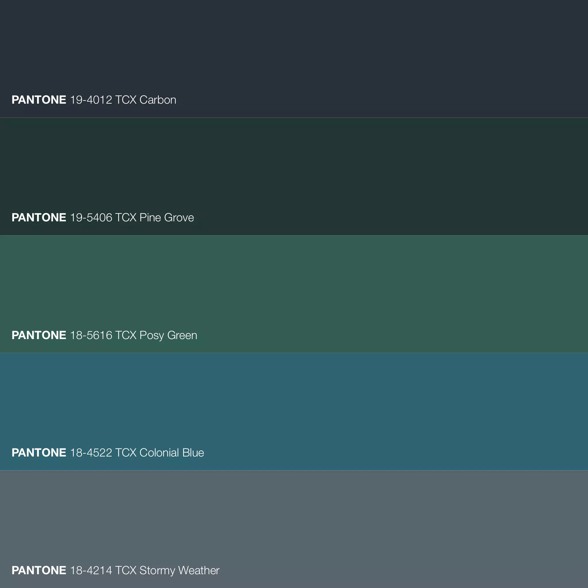
- PANTONE 18-4214 TCX Stormy Weather · FHI Cotton TCX · Lab 41,39 -2,48 -7,02 · sRGB 88 100 109 · HEX #58646D
- PANTONE 18-4522 TCX Colonial Blue · FHI Cotton TCX · Lab 38,81 -15,33 -13,99 · sRGB 46 100 113 · HEX #2E6471
- PANTONE 18-5616 TCX Posy Green · FHI Cotton TCX · Lab 35,17 -16,48 0,39 · sRGB 50 91 81 · HEX #325B51
- PANTONE 19-4012 TCX Carbon · FHI Cotton TCX · Lab 18,49 -1,04 -7,16 · sRGB 39 47 56 · HEX #272F38
- PANTONE 19-5406 TCX Pine Grove · FHI Cotton TCX · Lab 20,48 -9,66 0,21 · sRGB 34 54 49 · HEX #223631


Hues with History
At the heart of the palette lies the eponymous Colonial Pine Green, harkening back to the verdant forests that blanketed 18th-century American colonies. This rich, earthy shade exudes an air of timelessness and sophistication. Meanwhile, the Stormy Weather hue mirrors the contemplative character of a winter sky, adding depth and complexity to the palette.
From Ocean Depths to Spring’s Whisper
The Colonial Blue hue captures the mesmerizing depths of the ocean and the shifting hues of twilight, whispering of boundless beauty and endless horizons. Posy Green, a tender touch of green, hints at the renewal and growth that awaits beyond winter’s frosty embrace, offering a moment of serenity amidst the palette’s dramatic tones.
Anchoring the Palette: The Carbon Hue
The deep, dark grey of the Carbon hue provides a somber, grounding presence. Reminiscent of artists’ preliminary sketches, it adds gravitas, creating a cohesive, harmonious balance within the composition.
Harmony in Hues: The Power of Color Theory
The Colonial Pine Green palette masterfully blends analogous and complementary colors, seamlessly marrying the cool, moody tones of winter with the emerging warmth of spring. This delicate balance creates a visually stunning composition, capturing the essence of seasonal transition.
A Palette Rooted in Psychology
The choice of colors in the Colonial Pine Green palette is steeped in color psychology, evoking feelings of calm, tranquility, and introspection. These hues, long associated with nature, forge a deeper connection between the viewer and the natural world, inviting a profound appreciation for the beauty surrounding us.
The Colonial Pine Green palette is a testament to the artistry of color theory, crafting a visual narrative that captivates and evokes specific emotional responses. With its delicate interplay of light and shadow, cool and warm, it invites the viewer to lose themselves in the breathtaking beauty of the composition. This timeless palette, steeped in history and infused with natural grace, is a tribute to the enduring power of color.
Color inspiration from Kid’s Palette. Visit their website for full information and inspiration on these color combos and for more ideas.